Event Insights
This page covers the Insights tab of the Event Details page. The Insights section gives you a real-time snapshot of how your event is performing, using numbers, charts, and visual indicators so you can quickly understand what is happening with your event at a glance.
You must be signed in
You need to be signed in to the RU4M Backoffice to access the Event Details page. If you have not signed in yet, please follow the instructions in the Sign In guide first.
Event Overview (Insights)
The first thing you see when you open an event is the Insights section. This area gives you a real-time snapshot of how your event is performing. It uses numbers, charts, and visual indicators so you can quickly understand what is happening with your event at a glance.
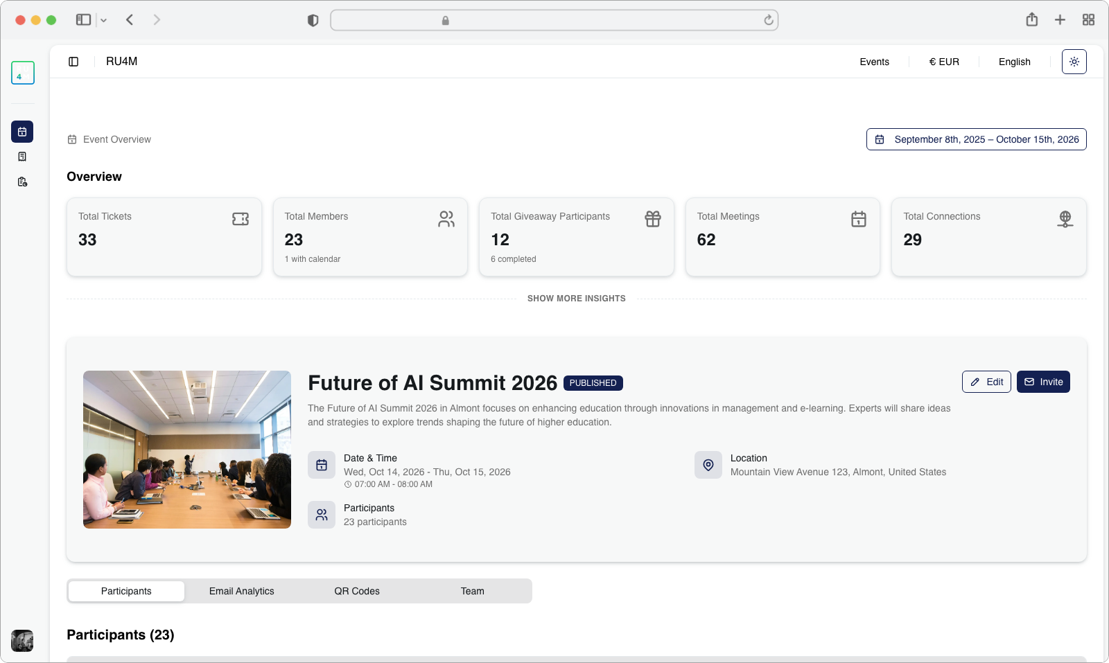
Overview Cards
At the top of the Event Details page, you will see a row of metric cards. Each card is a small rectangular box that displays one important number (called a Key Performance Indicator, or KPI) about your event.
Here is what each card typically shows:
- Total Tickets Sold -- How many tickets have been purchased for your event
- Registered Members -- How many people have signed up and registered to attend
- Giveaway Participants -- How many attendees entered your giveaway (if you set one up)
- Scheduled Meetings -- How many one-on-one meetings have been booked between attendees
- Connections -- How many connections attendees have made with each other through the app
Each card may also show additional context below the main number. For example, the Registered Members card might also tell you how many of those members have synced their calendar with the app, and the Giveaway Participants card might show how many giveaways have been completed.
What are KPIs?
KPI stands for "Key Performance Indicator." These are the most important numbers that tell you whether your event is going well. Think of them as a report card for your event -- each number tells you something specific about how engaged your attendees are.
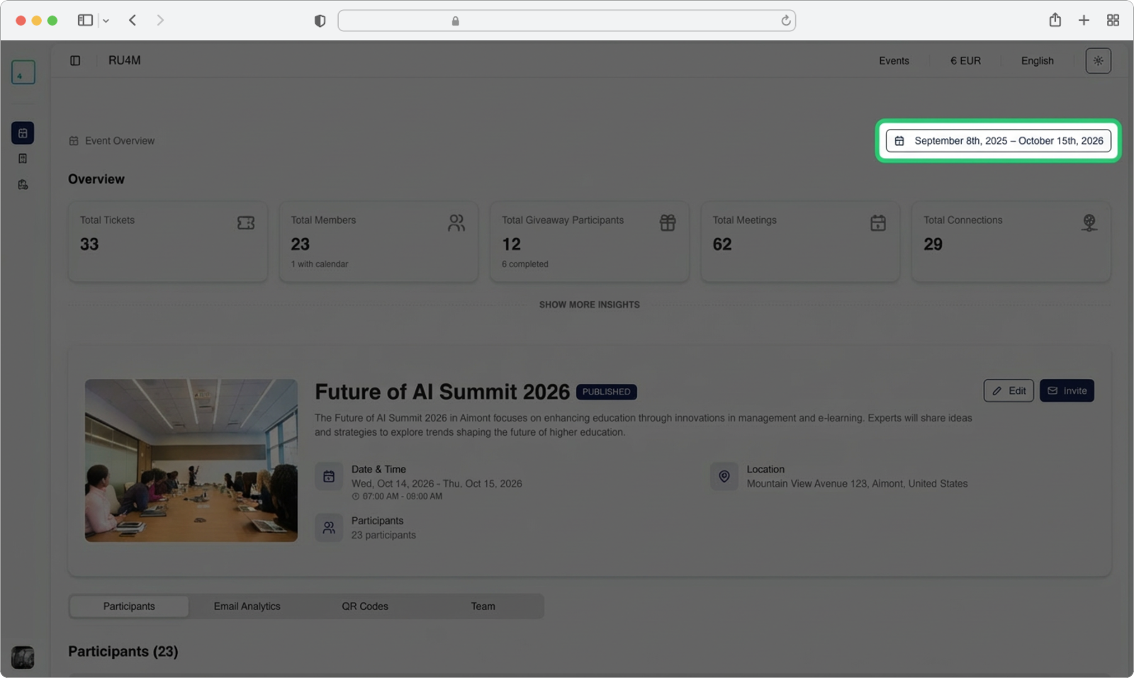
Date Range Selector
By default, the metric cards show data for the entire lifetime of your event (from the day it was created until the day it ends). But sometimes you want to see how your event performed during a specific time period -- for example, just the last week, or just a single day.
Find the date range selector
Look at the top-right corner of the Insights section. You will see a small control that shows a date range (for example, "Jan 15 - Feb 20"). This is the date range selector. Click on it.
Pick your desired date range
After clicking the date range selector, a calendar panel will appear. This panel lets you choose a start date and an end date for the data you want to see.
- Click on the start date -- find the day you want to start from on the calendar and click on it. The selected day will become highlighted.
- Click on the end date -- find the day you want to end on and click on it.
- Once both dates are selected, click the "Apply" button to update the metric cards with data from your chosen time period.
- If you change your mind and want to go back to the default (showing all data), click the "Reset" button instead.
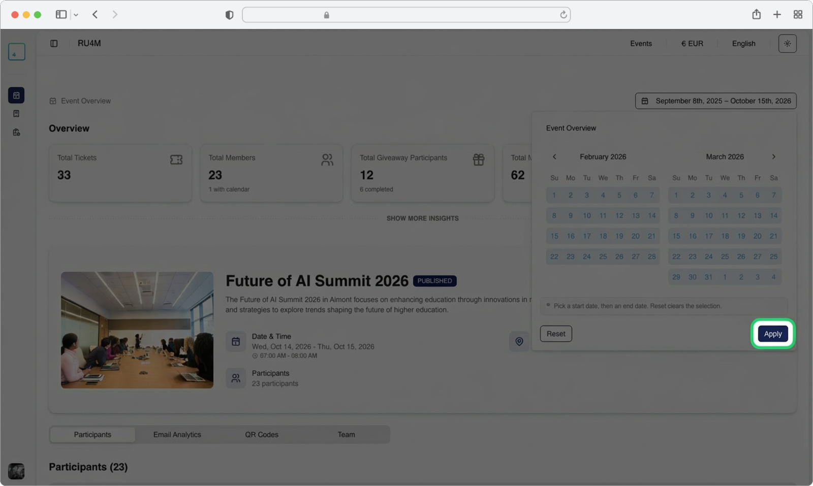
Date limits
You can only select dates between the event creation date and the event finish date. You will not be able to pick dates outside of this range. If a date appears greyed out or is not clickable, it means it falls outside the allowed range.
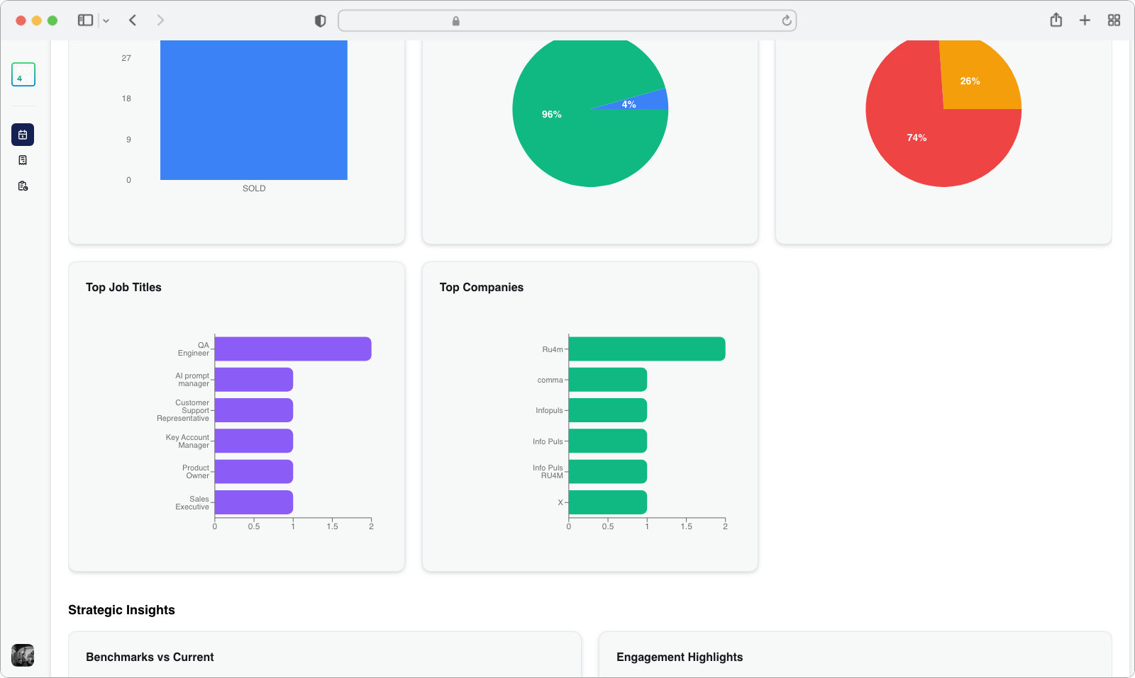
Detailed Analytics
Below the metric cards, there is a link that lets you expand a more detailed analytics section. This section contains charts and visualizations that go deeper into your event data.
Click "Show More Insights"
Look below the row of metric cards. You will see a text link that says "Show More Insights" (it may be styled as a clickable link in blue or another accent color). Click on this link.
Explore the analytics charts
After clicking, the page will expand to reveal the Analytics Charts section. This section shows interactive charts and graphs that visualize your attendee demographics and engagement. You will typically see:
- Charts showing attendee demographics -- such as which industries your attendees come from, or which countries they are based in
- Most common job titles -- a chart (usually at the bottom of this section) showing the most frequent job titles among your attendees
- Top companies -- another chart showing which companies are most represented at your event
You can hover your mouse cursor over any part of a chart to see more detailed numbers in a small popup (called a "tooltip").
Use these charts for event planning
The demographic charts are very useful for understanding who is attending your event. For example, if you see that most attendees are from the technology industry, you might want to tailor your speakers and content to that audience. If you notice a large group from one company, you could reach out to them for sponsorship opportunities.
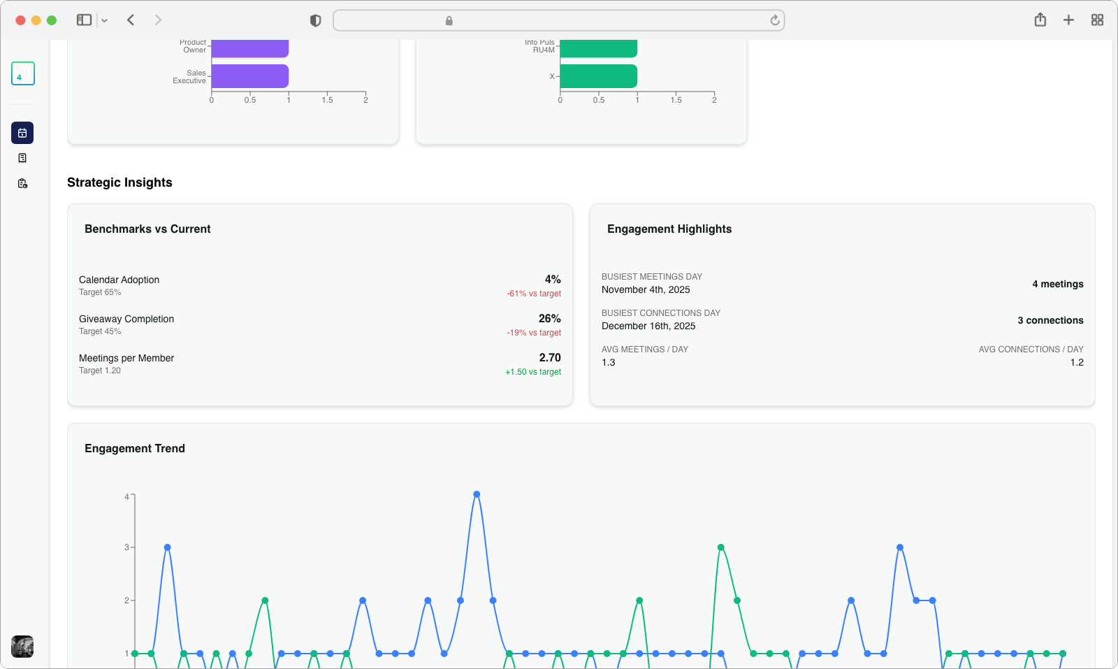
Strategic Insights
Scroll down a bit further and you will find the Strategic Insights section. This section compares your event's actual performance against your targets (the goals you set when planning the event).
You will see performance metrics for areas such as:
- Calendar adoption -- How many attendees have connected their calendar to the app compared to your target
- Giveaway completion -- How many attendees have completed the giveaway compared to your target
- Meetings per member -- The average number of meetings each attendee has scheduled compared to your target
Each metric includes a color-coded variance indicator:
- Green means you are meeting or exceeding your target
- Yellow means you are close but slightly below target
- Red means you are significantly below your target
Below the performance comparison, you will also see Engagement Highlights, which surfaces information such as the peak activity day (the day with the most engagement) and your daily average engagement numbers.
Engagement Trends
The next visualization is the Engagement Trend chart. This is a line chart that tracks daily activity over the entire timeline of your event.
The chart shows two lines:
- Meetings -- How many meetings were scheduled each day
- Connections -- How many new connections were made each day
You can hover your mouse over any point on either line to see an interactive tooltip -- a small popup box that shows the exact counts for that specific date. For example, hovering over a point might show "Feb 10: 24 meetings, 18 connections."
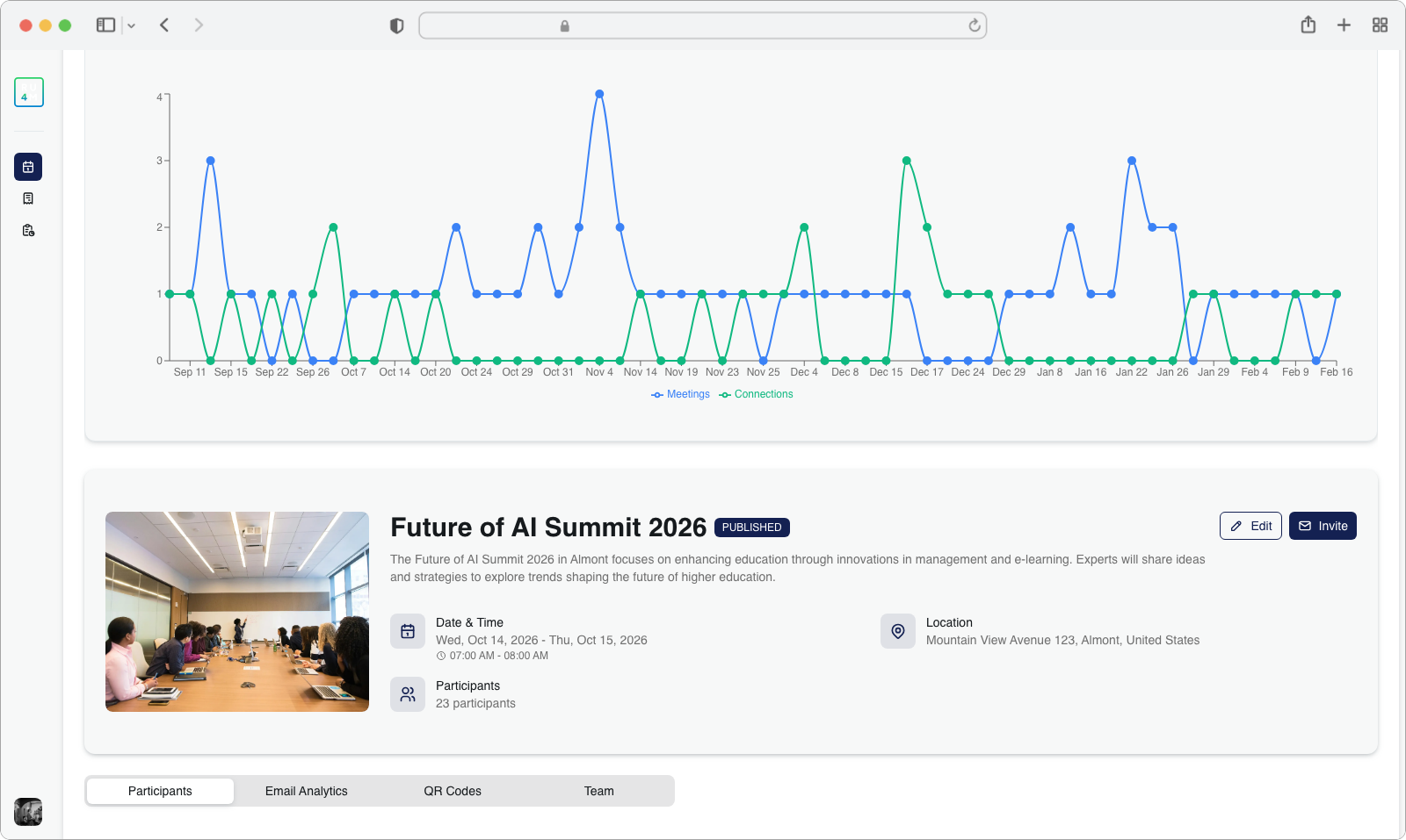
What do the lines tell you?
If you see a spike (a sudden upward jump) in the line, it means there was a burst of activity on that day. This often corresponds to a keynote speech, a networking session, or some other highlight of your event. Flat or declining lines might indicate quieter periods where attendees are less active.
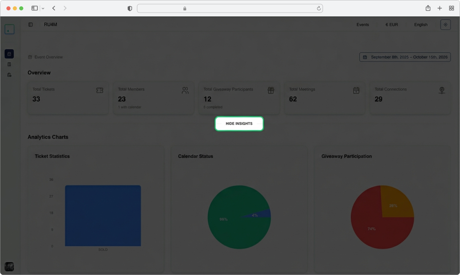
Collapsing the Insights Section
If you are done reviewing the detailed analytics and want to simplify the page, you can collapse the Insights section to hide the charts and go back to showing only the overview metric cards.
Click "Hide Insights"
Look for the text link that says "Hide Insights" (it appears in the same spot where "Show More Insights" was before). Click on this link.
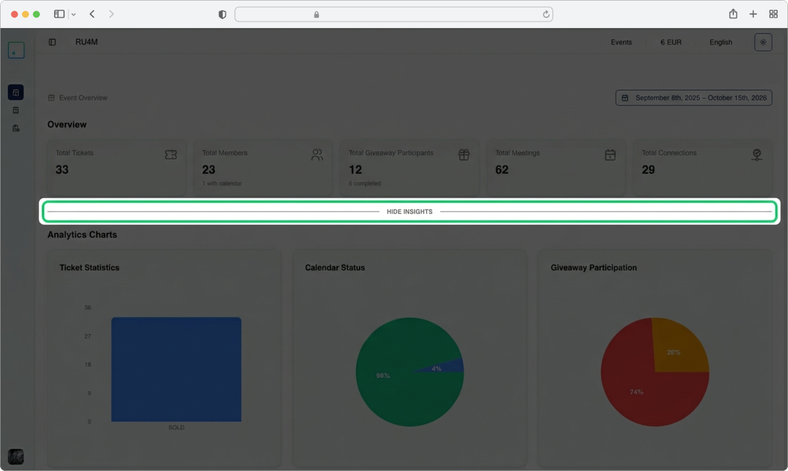
After clicking, the detailed charts, strategic insights, and engagement trend sections will collapse and disappear, leaving only the compact overview metric cards visible at the top.